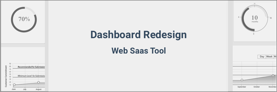
UX / UI Design

User Experience & User Interface Design

dashboard image header

The task was to redesign the existing dashboard of the company's web based SaaS tool.

The initial design was mostly used by developers to program the features to determine the feasibility of the tool and test the functionality of each component. After the features were finalized and fully functional, I was tasked to do the UI/UX testing on the Progress Tracker Tool and redesign the dashboard based on the user testing findings.

Role: UI/UX Designer

Task: Dashboard Redesign

Company: VenturX

Platform: Web

Tools: Sketch, Invision, Illustrator, Photoshop

About the Progress Tracker Tool Dashboard

The Progress Tracker tool helps prepare startup companies by optimizing their business data for a better chance of matching with an investor. Users update their business data using the dashboard and monitor their progress with the resulting data analytics. Once the data is sufficient and have reached the recommended level of submission, the tool will aggregate the data along with the startup company's other business information. The same tool will process the submission of the startup's application for funding to all investors that match the interest in their industry.

User interviews and Usability Tests

To find out user’s expectations on the Progress tracker tool, a usability and user experience test were done on the Progress Tracker tool dashboard. The users chosen were startup entrepreneurs, some are current users and the others are prospective users of the company's target market. Responses were organized on a spreadsheet. Positive and negative responses were color coded.

Dashboard test results
Image-1S Dashboard Usability Test and Interview Results

Test results were analyzed and categorized based on frequency of the same or similar response.

In summary, the following were the top issues and user concerns:

Usefulness: Users don't see the value of using the SaaS tool because it is not clear how the gauges work and how it can help them.

UI: Look and feel is not enticing to use with only four circles to look at.

Usability: Users don’t know what to do first or what to do next. They can’t find a direction

Overall feedback:Tool is confusing to use.

Identifying Issues and Wireframing the Solution

To address the user’s issues with the Progress Tracker Tool's dashboard, the problem areas were identifed and initial changes were designed on a wireframe for presentation to stakeholders:

Dashboard test results

Responsive Wireframe

Dashboard wireframe responsive

Redesigning the Dashboard

Style guide

Dashboard iteration 1

Redesigned Dashboard - Iteration 1

Dashboard iteration 1

This version went through another round of user experience and usability testing. A new set of users were asked the same questions and do the same tasks as the previous test session.

This group was able to understand the dashboard with little to no hesitation compared to the previous design. This time they were able to find their way around quickly with all dashboard elements visible, eliminating guesswork. Feedbacks about message placement, button placements and other elements lead me to do Iteration 2.

Iterating User Tests and Dashboard Design

Redesigned Dashboard - Iteration 2

Dashboard iteration 2

With the dashboard’s new UI design and introduction of better methodology in capturing data with the Product key metrics, the user experience has significantly improved. The dashboard’s clean look and more structured design gave clarity to the content. The dashboard’s new intuitive design is now usable and enticing to use. Users can immediately see the value of the Progress Tracker Tool for their startup business.

Investigating user problems in the Runway key metric

Runway key metric zoom

The problem:

The website redesign implemented earlier may have achieved better focus on the websites content and have started to use the dashboard. But out of the four key metrics in the dashboard the Runway seems to be the one that gets avoided. Those that attempt to go through it leave without completing it properly or not completing at all.

Usability Testing:

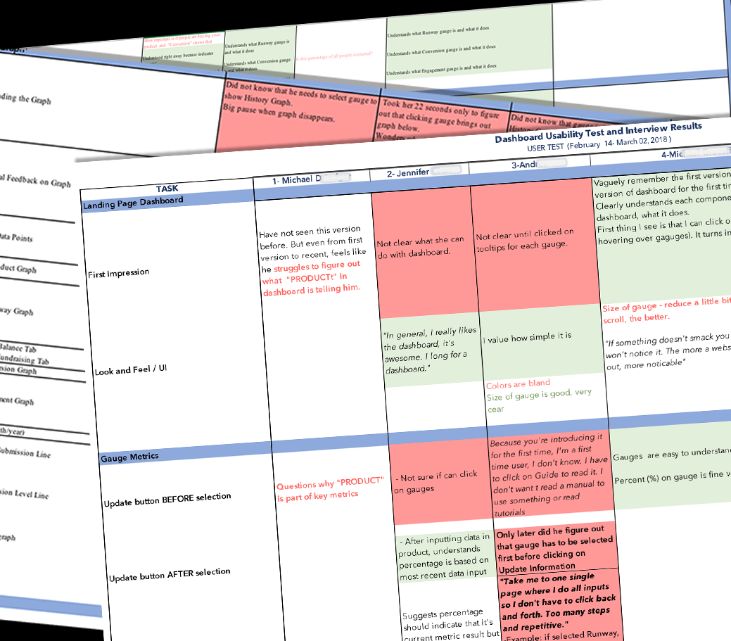
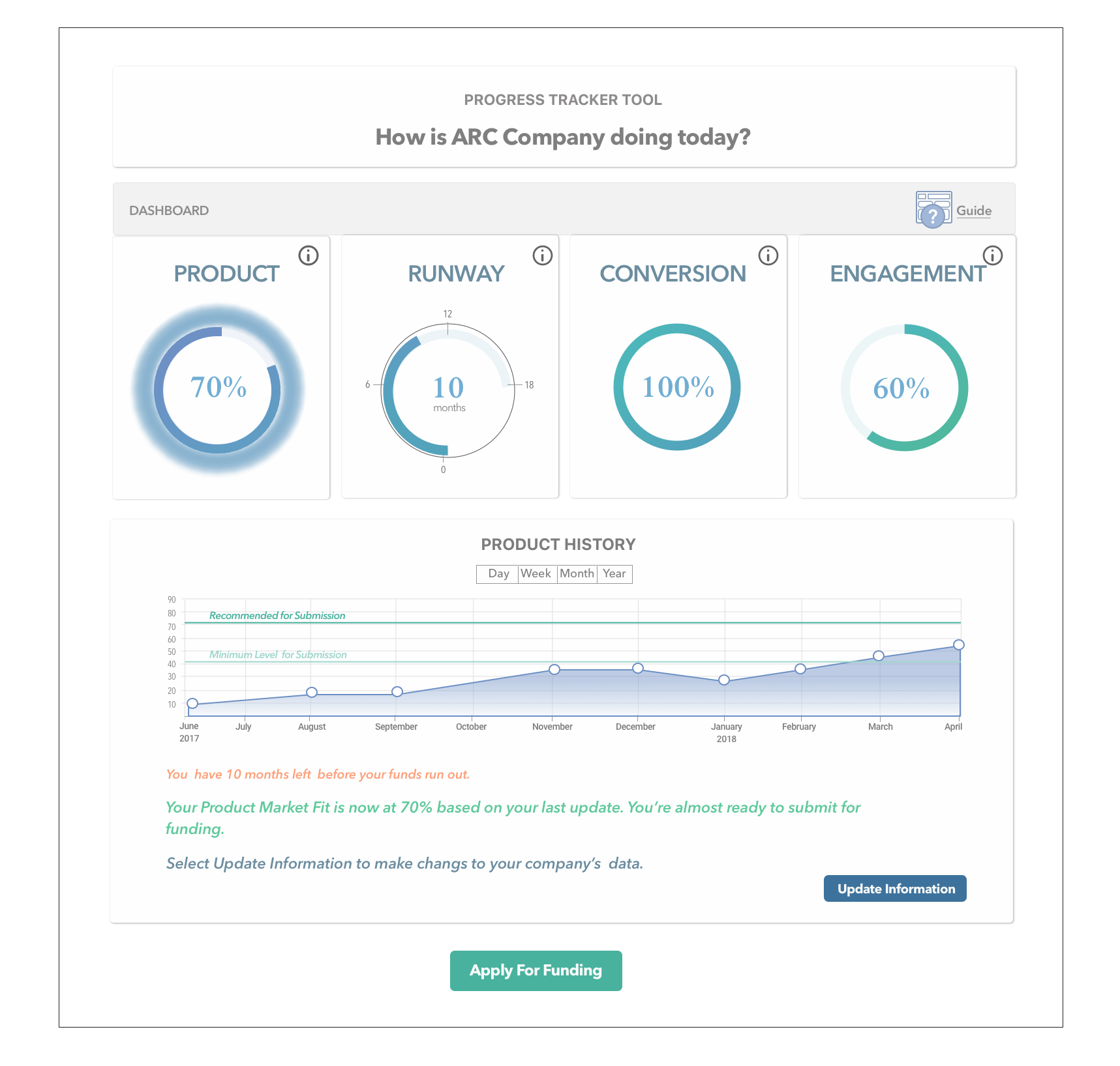
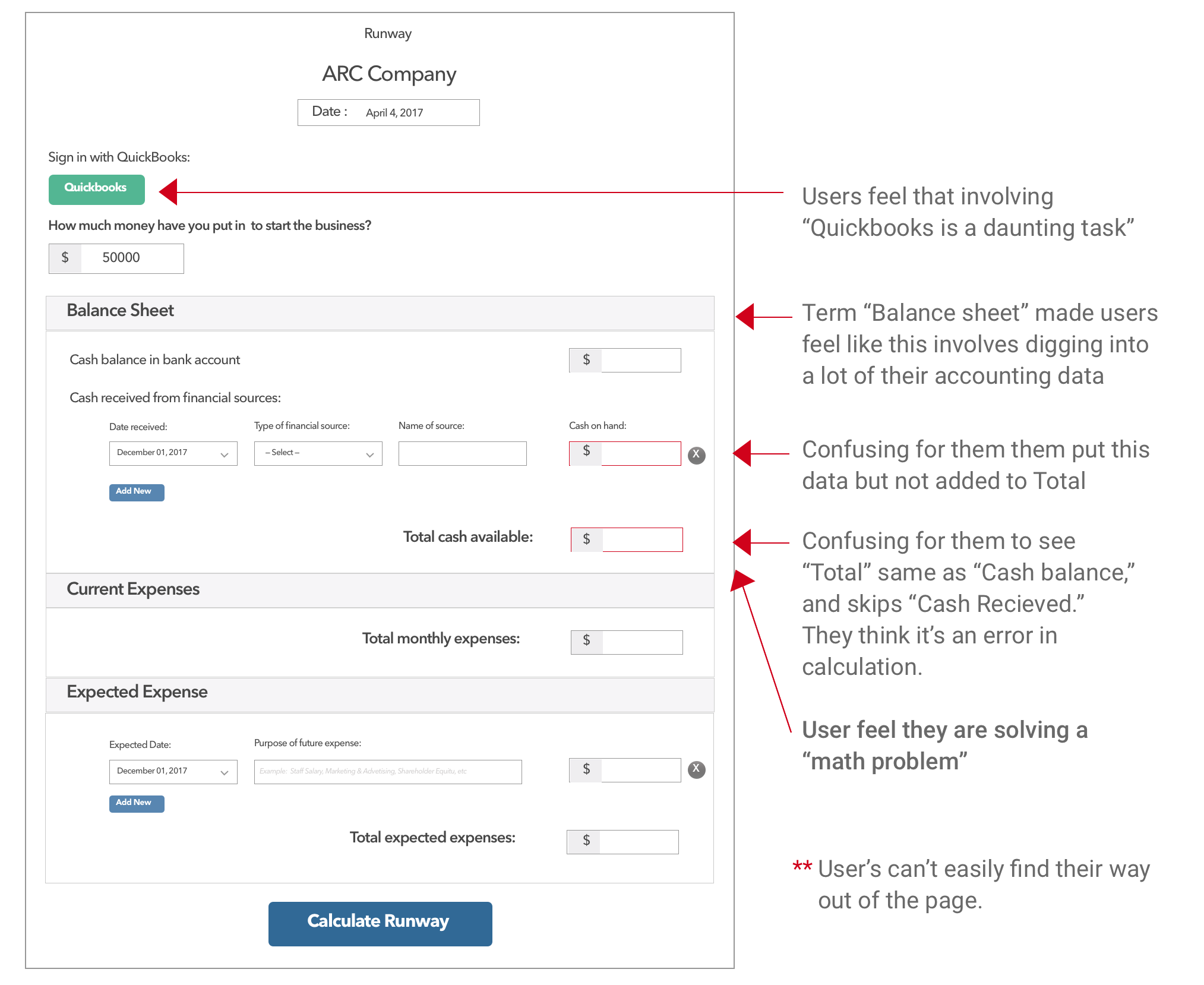
Testing was done using a beta page of this Runway key metric. I used a Performance Test to observe and listen as users interact with the task on the page. I identified the roadblocks that was common to all test users.

User Test Findings:
Runway test results

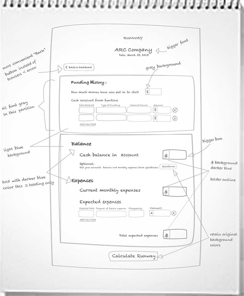
Designing The Solution:

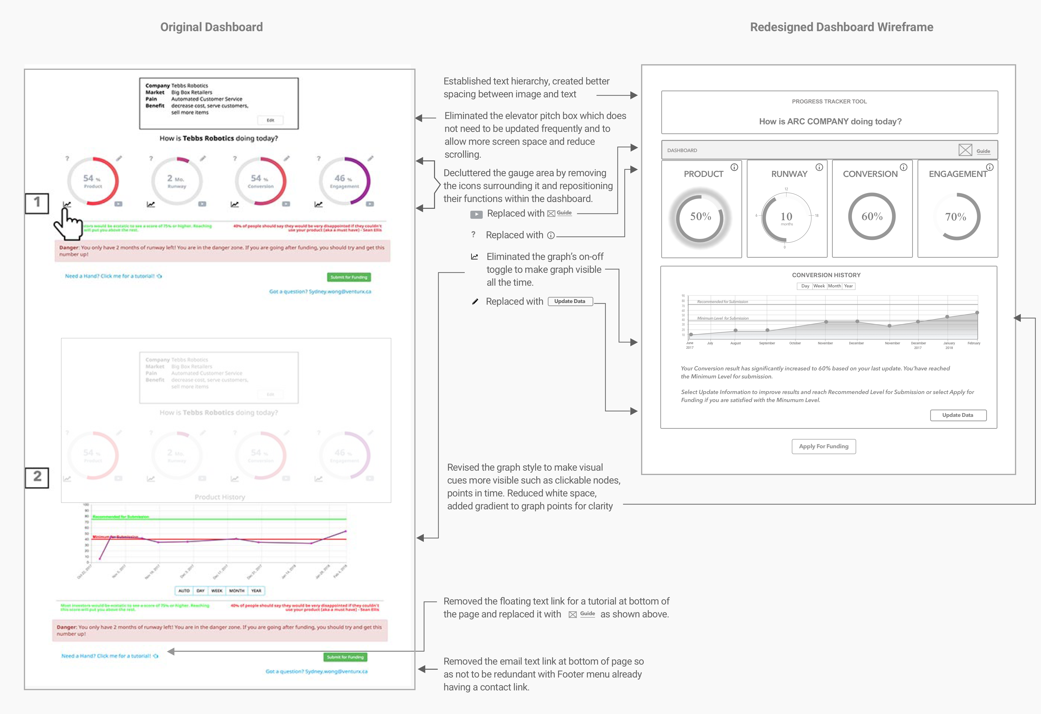
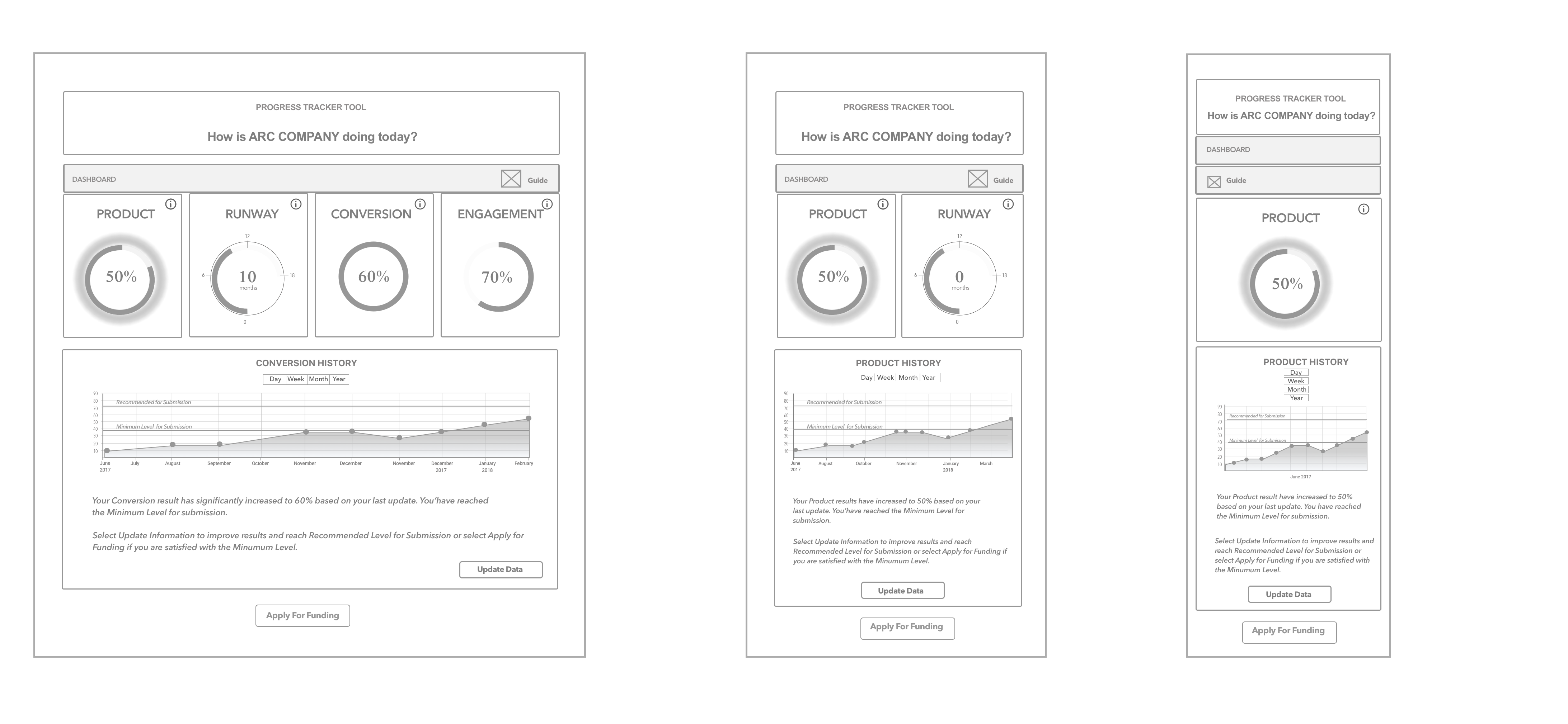
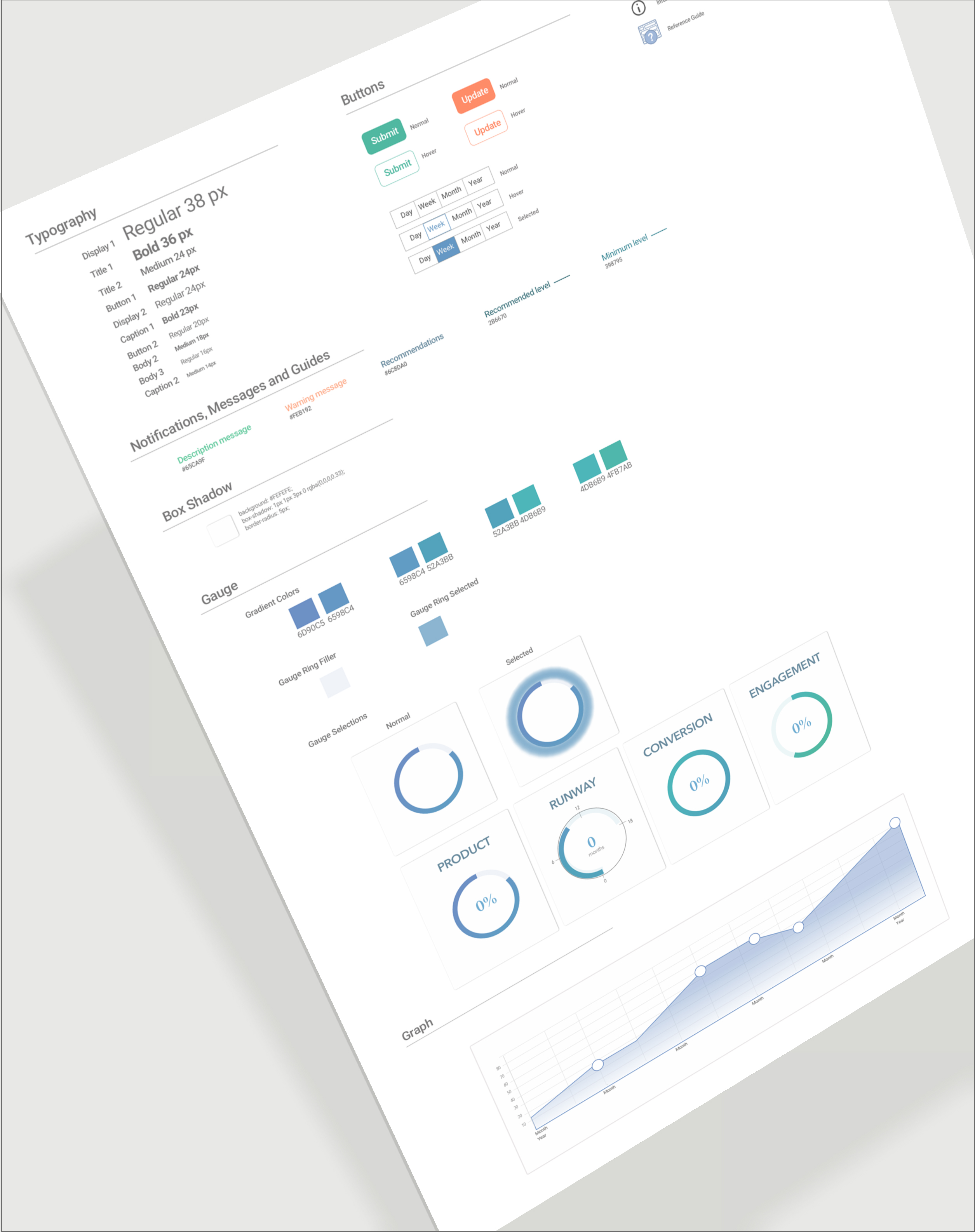
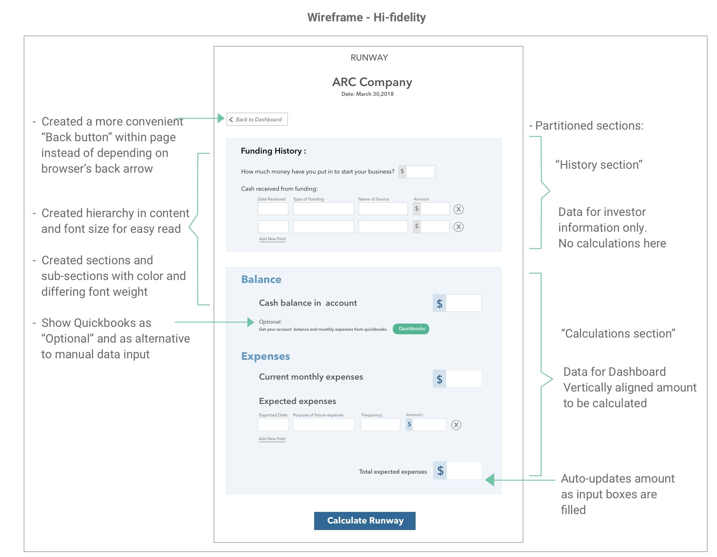
Redesigning the Runway key metric page from sketch to Hi-fidelity wireframe

Runway hand sketch Runway Hi-fidelity

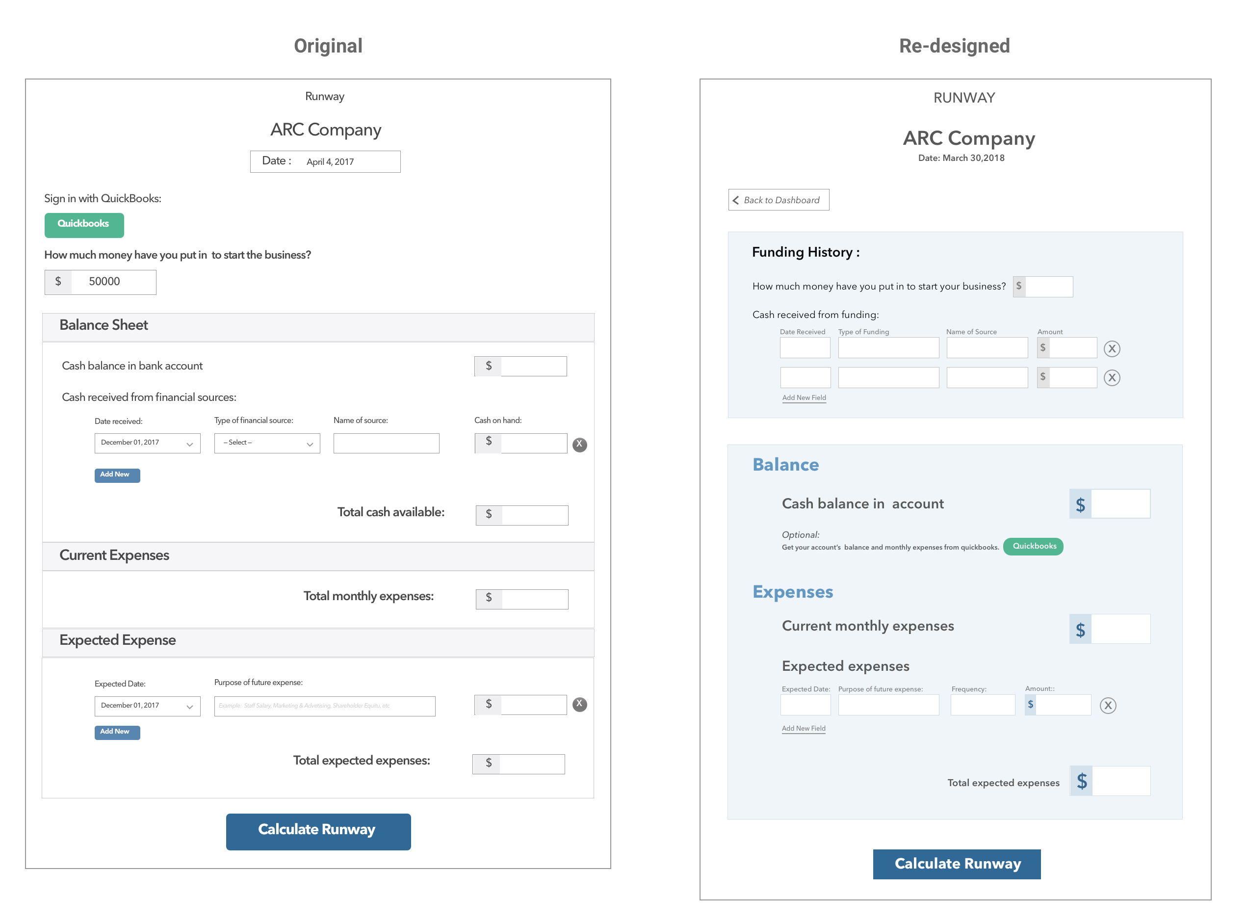
Comparing Before and After the Redesign:

Runway page comparisson orignal and re-designed

Retesting the New Design:

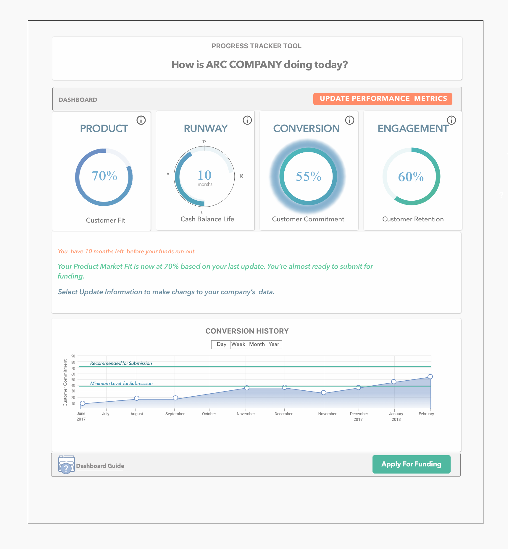
For the Usability Test, a new set of users were asked to do the same Performance Test on the redesigned Runway page. Observations and responses were compared with the results of the previous test.

Results of the Runway key metric redesign:

The following were the key changes observed:

- Data update is now being accomplished without hesitation,

- Time to accomplish task on page was reduced from 10 minutes to 4 minutes

- Full understanding of the required data for input

- Full understanding of Runway Key Metrics data result in relation to Dashboard result

- Full understanding of the Runway Key Metric interface

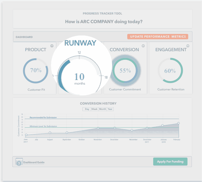
The result of focusing on one Key Metric from the Dashoard uncovered the real user problems about the page. The redesign addressed the issues and resulted in better ease of use updating the Runway or the company’s financial health. It also increased frequency of users updating their dashboard in general.