UX / UI Design

User Experience & User Interface Design

VX header image small
Atlas header image small
Website redesign intro image

Design Brief

I was tasked to uncover the reasons for the website’s low user engagement, retention and conversion. The requirement was to analyze the users, present the results, design and implement the design solutions. The goal was to improve the user experience to reduce user drop off and significantly increase engagement and retention.

Project Details

Role: UX/UI Designer

Company: VenturX

Platform: Website

Link: www.venturx.ca

Tools: Adobe Creative Suite ( Photoshop, Illustrator ), Sketch, Html, CSS

About VenturX

The company prepares early startup entrepreneurs for investor funding using their SaaS tool. Data analytics converts a startup company’s key metrics on a Progress Tracker Tool to a summarized result which is presented to investors to prove their traction in the market.

Research Insights

Using Heap and Google Analytics

To validate the assumptions, I sorted the website's data using Google and Heap Analytics to find out about the website’s Bounce Rate, user’s Time On Page and Conversion.

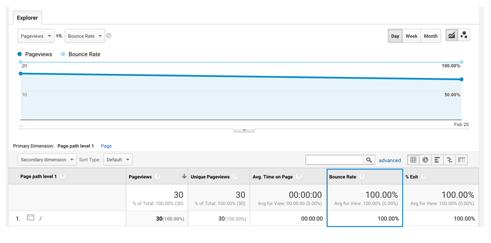
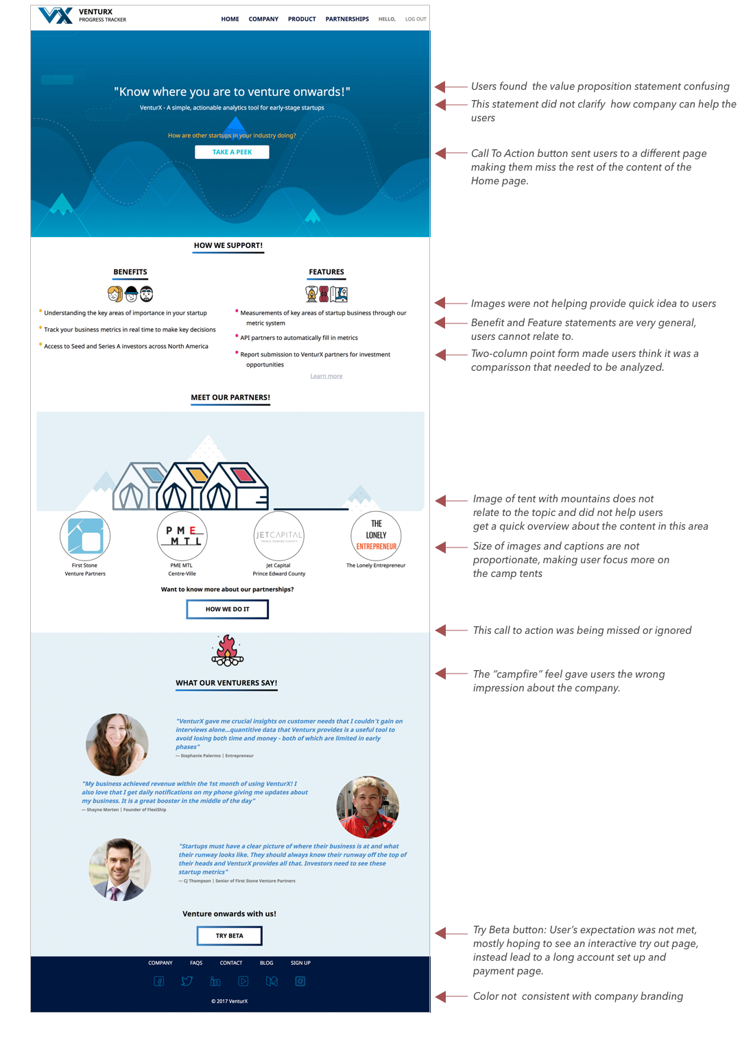
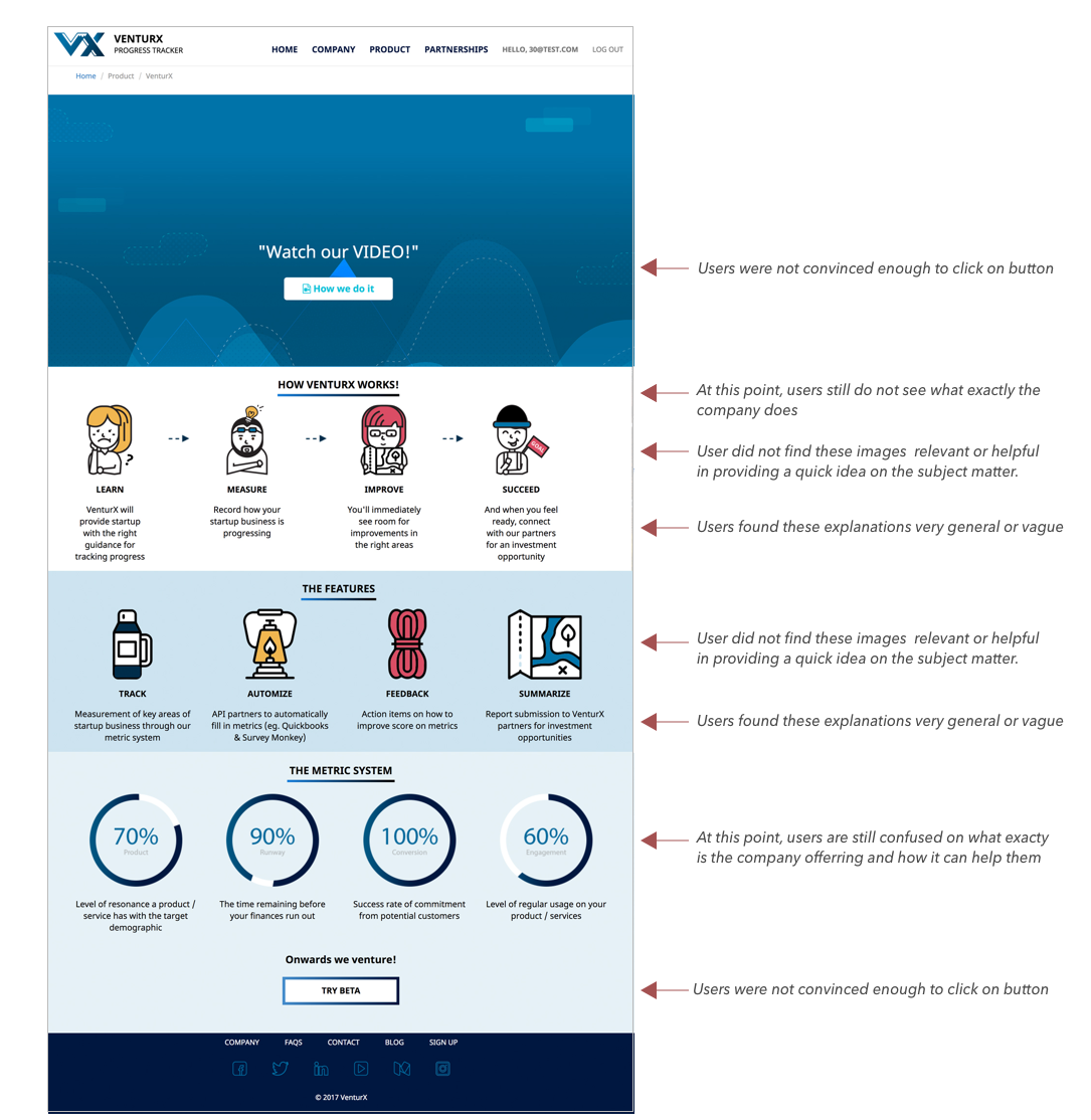
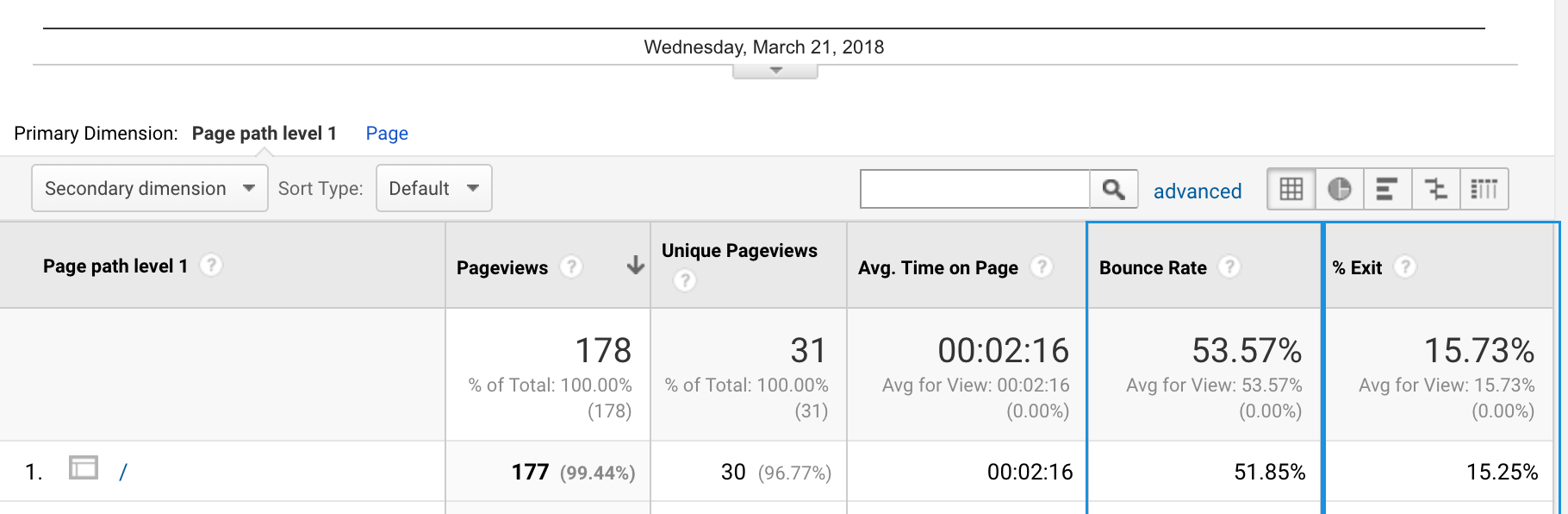
First, I focused on the most important page of the website - the Landing Page and Home Page. Starting with Google Analytics, I looked at the website's BOUNCE RATE results specifically on the Pageviews (i.e. each instance of a page load).

Google Analytics Bounce Rate result
Table-1-Bounce-Rate

The table above (Table-1-Bounce-Rate) is a screenshot of users in one day. It shows that everyone that viewed the Home page have NOT viewed a second page on the site.

But Google Analytics formula for Bounce Rate does not measure the time a user spent on the last page. If the visit is a bounce (that is, the visitor leaves after viewing just one page), no time will be recorded (i.e. 00:00:00)

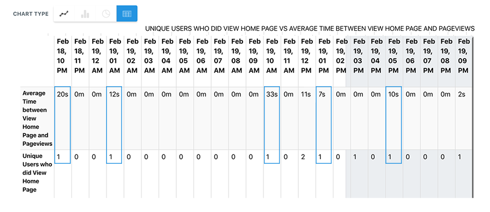
“So how much time do users really spend viewing or reading the content of a page?” To find out, I used Heap Analytics TIME ON PAGE.

Heap Analytics result
Table-2-Time-On-Page

Image above (Table-2-Time-On_Page) is a snapshot of Heap Analytics on time spent by each users within each hour of one day.

The results show users time on page is mostly under a minute, ranging from 7 seconds to 33 seconds. This is very fast considering the fact that the website has multiple pages, links and call to action buttons. “Are the users not interested in the content?” or “Is the content not catching their attention?”

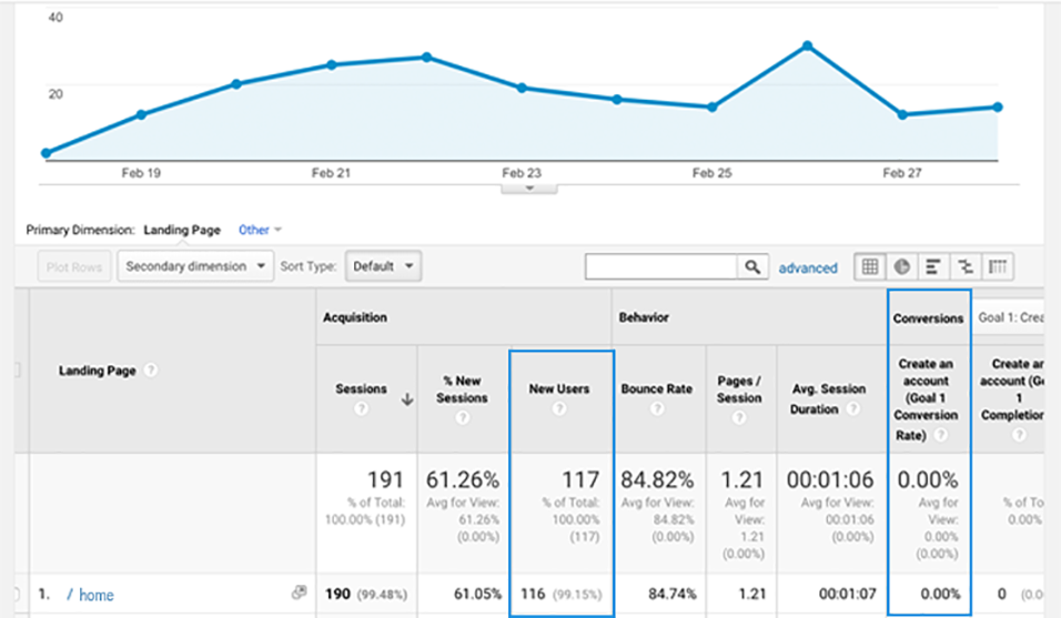
The third data I had to verify was Conversion. Below is a snapshot of Google Analytics CONVERSION table based on a one-week period (Table-2-Conversion ). It shows that out of 177 users that interacted with the website averaging to 191 sessions, none have signed up.

Google Analytics Conversion Result
Table-3-Conversion

So to find out reasons for high drop-offs and low engagement, I conducted Usability Testing sessions.


Contextual Interview and Usability Testing

Qualitative Research

Interviews and user tests were done with the company’s intended target market group, comprised of early or advanced startup entrepreneurs. Remote user testing sessions involved screen share and screen capture. Test users were observed using their own computers or devices. They were asked to speak their thoughts aloud while going through some tasks on their own and as directed.

Quantifying the Results

The interviews were transcribed on a spreadsheet which includes my observation results and the test users’ actual comments. All results were organized, quantified and tallied by code on a table that specifies the parts or elements of the website.

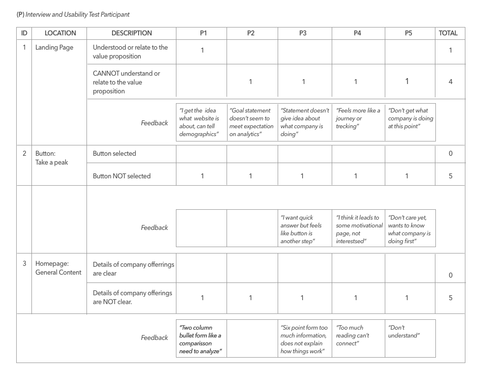
The results were categorized by website page. Table-4 below is a snapshot of a quantified result from five participants that completed the task in the Home Page

Quantified result chart
Table-4-Home Page Test Results

Analyzing The Results

The results yielded several pages with long tables. But in summary, there were four areas on the website where majority of the test users had an issue with: Initial Landing Page, Home Page Content, Product Landing Page and Product Content

Snapshot-1-Home Page Analysis
Home page analysis

All result formats were presented to stakeholders and developers to provide different angles of the analysis and to point out the problem areas easily with various visuals.

Snapshot-2-Product Page Analysis
Product page analysis

Designing The Solution

Mid-Fidelity Wireframes

wireframes

Style Guide

style guide

The Redesign Solution in Hi-Fidelity

1- Homepage Redesign

Home page before-after redesign details

2- Product Page Redesign

Product page before-after redesign details

Result of Redesign

Revisiting Google Analytics

In less than two weeks after the redesigned website was uploaded, the Bounce Rate was significantly reduced to 46.43%. Exits significantly dropped from 100% to 15.73%. This means the users are now staying longer on the pages and consuming content.

Google Analytics result

The results may not have reached the stakeholders desired numbers but because it shows a good improvement from the original website, this is a good base for iterating user tests and improving on the design.

As for Conversion, it was slow with everyone needing some hand holding and a walkthrough of the process. What was achieved was the goal to first capture the user’s attention to the content of the website and interact with it more. But there's definitely something that's making the users need assistance in this section. So a different user test session was done for the website section Sign Up or Account Set Up to investigate the issues with Conversion.