UX / UI Design

User Experience & User Interface Design

kijiji logo

Mobile App Redesign

A UI/UX Case Study

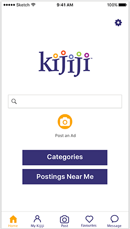
Kijiji has been one of the top online classified advertising service allowing individuals and communities to post local ads on their online space.

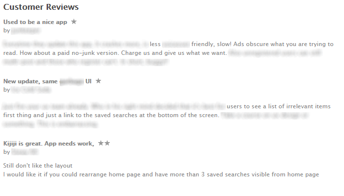
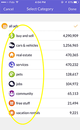
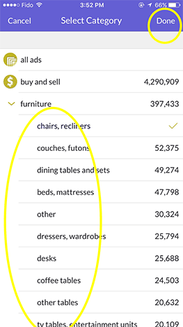
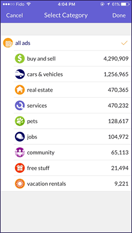
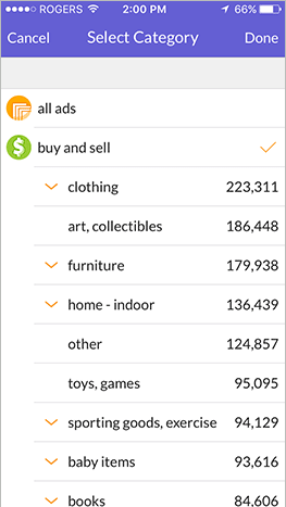
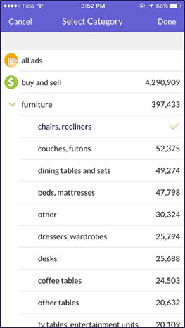
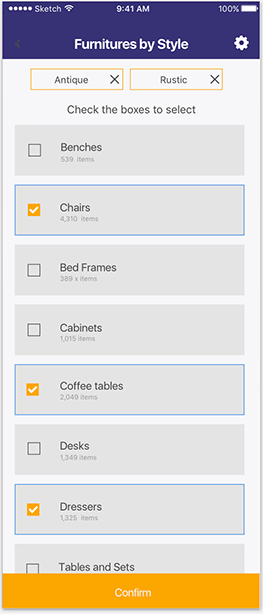
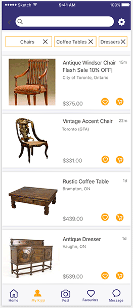
Through time, the number of goods and services being advertised has overcrowded and saturated this advertising space. The result is a confusing categorization of items which makes searching difficult.

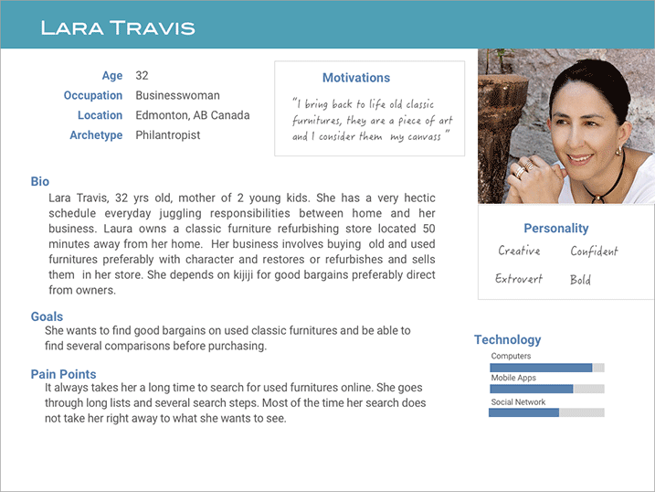
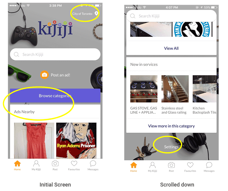
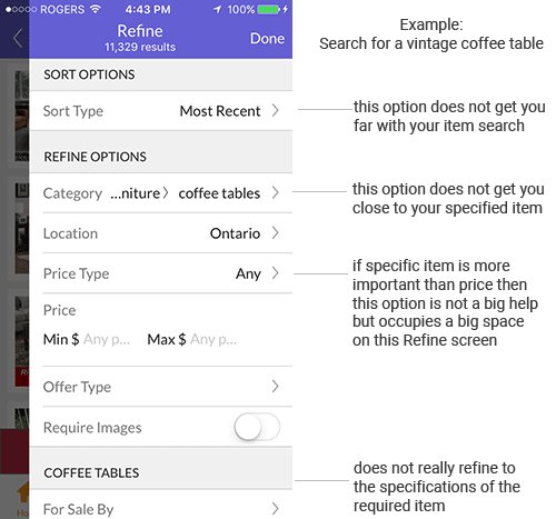
This lead us to use Kijiji mobile app for a usability case study. We tested for ease of use and uncovered some user pain points throughout the app's search process.

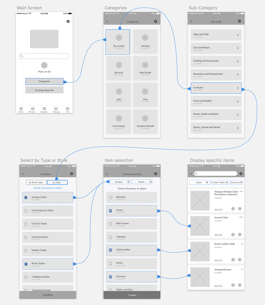
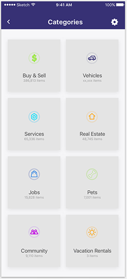
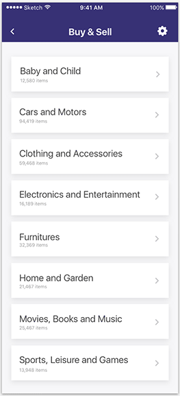
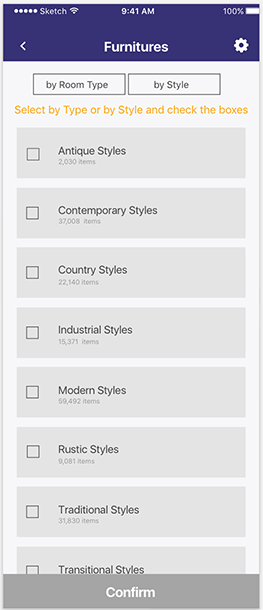
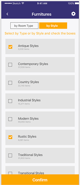
The solution was to redesign the UI to give users a faster and more efficient way to search.

UI/UX Designers: Michelle Del Rosario Gordon
and Claudia Xu

Project Type: Mobile App Redesign - Case Study

Platform: Mobile

Tools: Sketch, Invision, Photoshop

Understanding the users

The first step was to perform an online research around Kijiji’s customer-base. We then created a provisional persona to cover the hypothesized, largest group of customers: small independent business owners from early 30's to mid 50's.

Persona

persona

Reviewing feedback from customers

We searched for reviews from various sites and analyzed them. Below is a screenshot of some comments from itunes.apple.com. "Inappropriate" remarks were obscured as well as the username of the reviewers.

apple itunes reviews

Analyzing the problem areas of the current UI

We evaluated the app starting from the main screen, identifying and analyzing the areas where the user's complaints or pain points are coming from.

1 - Main Screen

  • Cluttered, too many items trying to catch your attention.
  • Intrusive "Ads Nearby"
  • Inaccessible "Settings" button
Main screen
All ads screen

2 - All Ads Screen

  • Unordered "list style"forces users to read line by line.
  • Not easy to spot categories, list categories begins in lower case.
  • Unclear purpose or meaning of number figures on the right.
  • Relevance and timing of number figures too soon for users to be able to relate to.
  • Extra step "Done" button.

3 - Select Category Screen

  • List is not alphabetical,forces users to read line by line until they find the item they need.
  • List begins in lowercase difficult to search items.
  • List from search not so relevant to specific item being searched for. Listing is based on highest number of ads.
  • Repetitive process, can only select one item at a time from the list. User repeats process if choosing more items from list.
  • Extra button, selection does not bring up page of item, user has to go to the top right to click "Done" - just an extra step.
Category selected screen
Refine screen

4 - Refine Screen

  • Purpose of screen not fulfilled. Refine does not really refine the search.
  • Options are very general
  • No real focus on items user is searching for.Refine options are mostly for seller, not easy for buyers.

Wireframing the new search experience

We sketched several options, chose the best one and translated it into low fidelity wireframe then later to a mid-fidelity wireframe. The example flow below is based on the persona of this case study. A refurbishing furniture business woman wants to have an easier and less time consuming way of searching for items on Kijiji app.

Mid-fidelity Wireframes with a sample information architecture flow and the simplified search process.

Example Search: Buy old, used, antique or rustic furnitures
wireframe

Comparing original vs our redesign version in Hi-fidelity

The prototype was completed by ensuring the company branding was in place including logo, colors and assets from the original UI. Slight variations were made on the color placements and some icons were replaced for clarity purposes.

What was improved:

1 - Main Screen

  • Decluttered the Main screen.
  • "Ads Nearby" replaced with a more welcoming title "Postings near me."
    -This gives more value to the user, making them feel that this category may also be useful for their search.
    - The button increases the chance of it being noticed instead of being disregarded in its ad format.
  • "Ads Nearby" was converted into a button, same level of importance as Categories and becomes less intrusive.
  • "Settings" was moved to the top right of the screen for better visibility. Replaced the word with a gear icon.
ORIGINAL
Main screen-original
REDESIGN
Main screen-new

2 - Categories Screen

  • Converted the presentation style from "list style" to "box style".
  • Icons replaced with much sharper and clearer graphics.
  • More white space between categories
    - This makes the eyes scan through selections faster.
ORIGINAL
Categories screen-original
REDESIGN
Categories screen-new

3 - Sub-categories Screen

  • Capitalized first letter for better differentiation.
  • Alphabetically arranged sub-categories for easier search.
  • Number value is now underneath the category name with reduced font size. These values may not have much relevance yet to the search process.
  • Increased font size of sub-categories to emphasize its importance over the number values.
  • Replaced the spot where numbers used to occupy with arrow icons.
ORIGINAL
Categories screen-original
REDESIGN
Categories screen-new

4 - Product Selection Screen

(Example: Search for antique or rustic furnitures)
ORIGINAL
Single selection only
Categories screen-original
REDESIGN Unselected State
Further Categorization
Product type or style unselected-redesign version
REDESIGN Selected State
Multiple selections
Product type or style selected-redesign version
  • Further categorization was added to narrow down search results
  • Ability to select more than one option on the list using checkbox method. This eliminates frequent returns to the product category screen to make another selection.
  • Added a "Confirm" button at the bottom, which is the direction of the scroll.
  • Removed the "Done" button at the top right.
  • Number value is shown underneath the item name. Only at this point does these numbers begin to have relevance in the search process.
  • Reduced font size of the numbers to give more emphasis on the item which is more important in the search.
  • Selections are spaced out and contained in their own box for readability

5 - Item Selection Screen

(Example: Search for antique or rustic furnitures, preferably chairs, coffee tables and dressers)
ORIGINAL
Single selection - All coffee tables
Single item selected
REDESIGN
Categorized with multiple selections:
Item selection
REDESIGN
Display based on search requirements:
Item display
  • Displays items based on category selected.
    Eliminates extra time looking at items not needed.
  • Multiple selection is enabled for more efficient search.
  • Hierarchy is emphasized.
    Reduced font size of price to avoid clash with item's image size.
  • Decluttered screen, more white space. Eyes can scan faster.
  • Category tabs on top can be removed for better management of items to display.

Summary

The redesign concept and prototype:

  • Decluttered search and item display screens, more white space and item distinction.
  • More categorization options for better search results.
  • Hierarchy in text and other screen assets for better eye focus.
  • Enabling multiple item selections for more efficient search.
  • Reduced steps in searching for items or services.

Value to users:

The redesign concept aims to provide users of Kijiji app a more efficient search process. Providing multiple options and a customer friendly interface minimizes frustration and wasted efforts in performing a search.