UX / UI Design

User Experience & User Interface Design

VX small image
Atlas small image
NNL Website redesign intro image

Design Brief

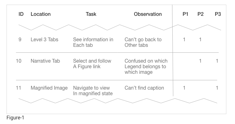
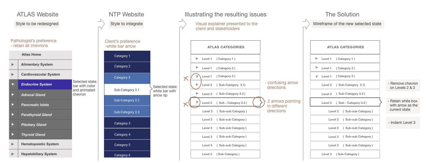
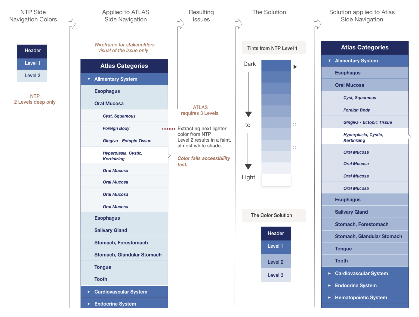
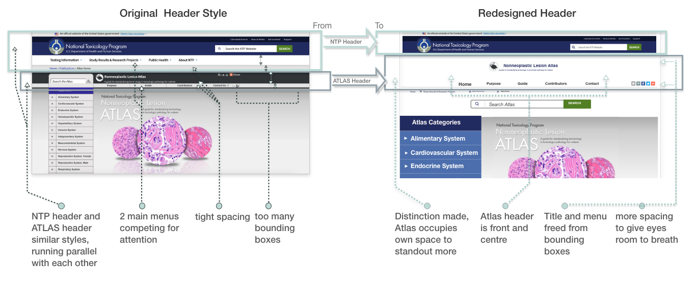
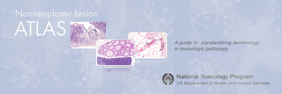
The Nonneoplastic Lesion Atlas is a pathology website incorporated within the National Toxicology Program government website. It was originally created externally and maintained through a third party. The graphite theme of Atlas does not conform to the NTP branding. It looks like a completely separate website.

As the parent website, NTP wanted Atlas to be redesigned to align its look and feel. All existing issues on the Atlas fuctionalities or user issues must be addressed on the redesign.

Project Details

Role: Design Lead

Client: National Toxicology Program (NTP)

Project Site: Nonneoplastic Lesion Atlas*

*(This it the original website. The redesigned version will be implemented after completion of website migration to a new CMS)

Tools: Adobe XD, Photoshop, Illustrator, Adobe Premiere and Audition, Sketch, Html, CSS, Javascript, Zeplin-for developer hand-off.

About the Nonneoplastic Lesion Atlas (NNL)

The Atlas provides diagnostic guidelines for microscopic nonneoplastic lesions for better understanding of human environmental diseases. It is intended for pathologists, scientists and researchers.

About the National Toxicology Program (NTP)

It is an inter-agency program run by the U.S. Department of Health & Human Services to research, coordinate, evaluate and report on the health effects of chemical agents in the environment.

The Ask

1. Client Requirements:
  • Replace the graphite (gray/black) theme of the current site and make it look more cohesive with the parent site.
  • Address the clash of 2 header styles and 2 search boxes.
  • Replace design and efficiency of the following:
    • Sidebar navigation
    • Search filter navigation Style
    • Search filter results display
    • Improve Lightbox functionality for all types of image views
2. Stakeholder Requirements:
  • The Experimental Pathology Labs requires the search facets to be retained.
  • Developers are migrating the CMS to Drupal, all website elements must be redesigned using available Drupal modules.
  • (i.e. side navigation, lightbox, etc.)

3. Blockers:
  • IT Security has restricted the use of any third party cloud (i.e. Adobe Cloud). Must use alternatives.

User Research

The client was initially informed of the various issues of the Atlas website by the Stakeholders before the redesign. To find out more details, an interview was conducted with the Experimental Pathology Labs, specifically the Biology Digital Imaging unit team.

User tests were also administered to get information on their experience using the website.

Users: Pathologists, Scientists, Researchers

Method: Interviews, Moderated remote and in-person usability tests

User Test Results: The areas identified with issues were mainly in the Atlas sublevel categories and image navigation in a lightbox gallery.

User test result screenshot

Analyzing the Redesign Transition of Elements

The focus of this section is the analysis of how the redesign was done in detail. The following are the webpages that received a considerable amount of attention and went through further deliberations and testing. Each image below shows the design solution to find a middle ground:

Side Navigation

  • The Selected State

  • Design solution to the opposing views

    Home page analysis

    The functionalities have been tested and positive feedback has been attained. Hi-fidelity wireframes were then created to show the new colors or branding of the Atlas website.

    Figure-2
  • The Side Navigation Color Palette

  • Correcting the colors for the sidebar

    Side navigation color palette correction
    Figure-3

The Header Style

Resolving the issues with the double header style

The Atlas website was originally created and maintained through a third party prior to being integrated into the main NTP website. This is why the design and the look and feel are completely different.

The following shows how the double header style was transformed to solve the visual experience issues.

Double header style correction
Figure-4

The Search Page

  • The Case of the Different Search Formats

Redesigning the Search Page by understanding the purpose of the search

To come up with a design solution to the search format dispute, the purpose of the search was analyzed for both NTP and Atlas. A comparisson was presented to show the difference.

The final design introduces a third search format, the radio Button which serves as the a middle ground. The on or off function is able to retain the search facets that is imperative to the stakeholders and it also made way for the implementation of the look and feel that the client required.

Although slight variations had to be made in some areas, the new search page style was tried out and accepted without further issues.

Double header style correction
Figure-5

The Redesigned Pages and Architecture

The website has over 9,000 pages and over 12,000 lesion images. The following are the core pages of the site that were redesigned.

Figure-6